I always find that looking at badly designed websites alongside with good designs is not only fun but also draws important lessons for designers and provides great pointers for small businesses who might be looking to have their first website designed.
Jared Spool, the American writer, researcher and usability expert, once said: “Good design, when it’s done well, becomes invisible. It’s only when it’s done poorly that we notice it.” So, let’s look at three examples of really horrible designs, shine the light on how good design makes it work, and distil some lessons so we can all create great and invisible experiences for our users.
Information Overload
The Bad: Parking signs in Los Angeles.
If you have ever been to L.A. in the 2010s you will have noticed the crazy parking signs found everywhere around the city and I get it, in almost every big city, the traffic rules are complex and signs are trying to convey a lot of information in a very small space. But how bad are these signs?
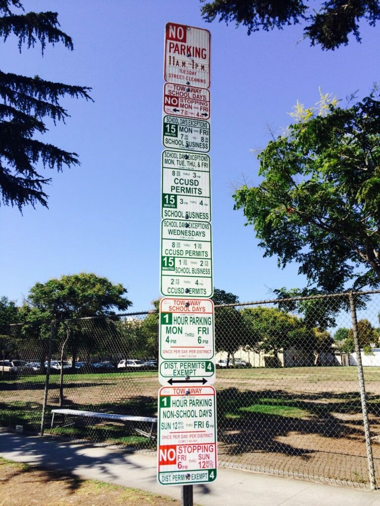
Pretty Bad. Imagine you are driving on this road on a busy Monday morning and trying to figure out parking; How confusing is that?
It’s happening more and more, we try to present as much information as possible in very small spaces. Spaces are becoming smaller and the amount of information delivered only gets more complex; perfect example being mobile websites and apps. So is there a solution to the problem? Nikki Sylianteng did it in L.A.
The good: Nikki Sylianteng’s design
Brooklyn designer Nikki Sylianteng did it. Her signs are currently used in L.A.
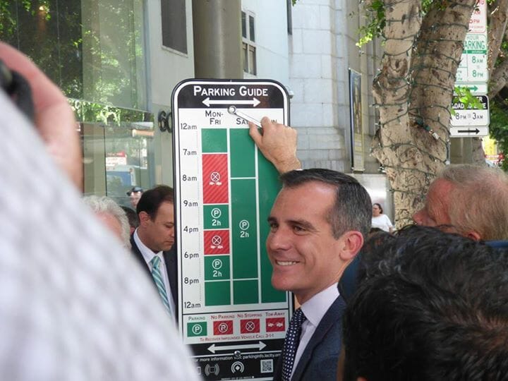
Why is it better?
Because it’s user centric. It will take the average driver about 4 seconds to understand whether parking is allowed or not.
Because it’s visual. There is very little text on that sign. The designer instead is using colours to convey: yes park, no don’t park. Green or Red. Simple.
Lessons to learn:
- Understand what your users need, then design based on that. This helps reduce information overload and information that is potentially completely unnecessary. Keep it clean and simple.
- Try using visuals instead of text. Humans are visual, use that to your advantage.
Mystery Meat Navigation (MMN)
The bad: The-Berg.de
Coined in 1998 by Vincent Flanders of Web Pages That Suck2, the Mystery Meat Navigation (MMN) is when elements of a page are not visible to the user until activated by pointing the cursor to it or clicking on it.
MMN is terrible because it reduces the discoverability of elements of your website and because your users feel as if they have to guess where they clicking.
It’s generally easy finding Mystery Meat on older websites; sadly it’s also quite widespread on modern web designs like the website for The Berg Gallery:
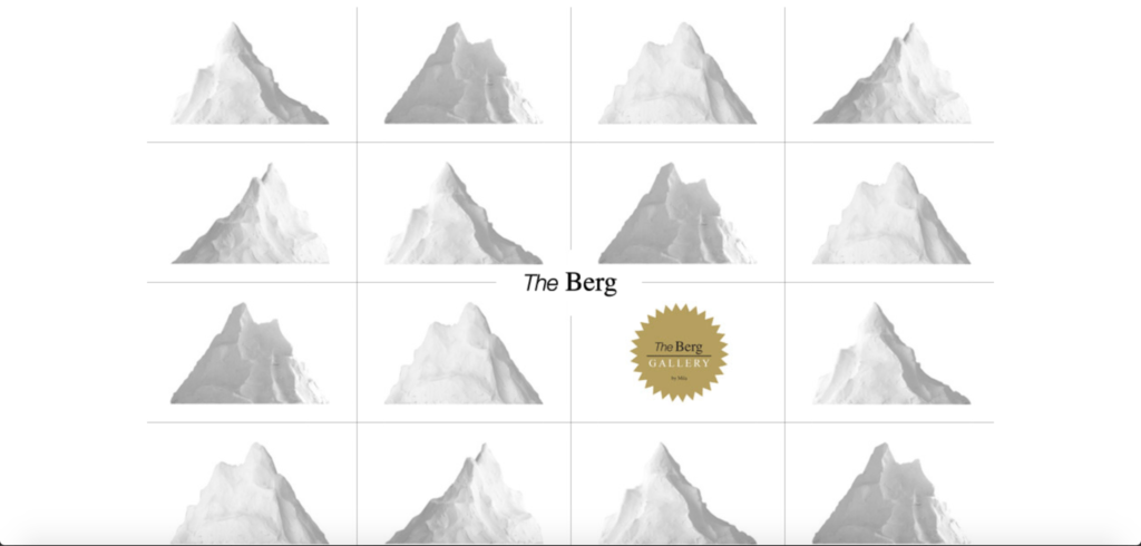
Each hilltop hides a navigational component of the website. It took me about 40 seconds to figure out where the gallery was based out of (It’s the last hilltop bottom right).
Justifications like “Click to find out!” or “Explore the website” is never a good User Experience (UX) solution. Chances are, your users are going to abandon their navigation and find an alternative solution on a competitor’s site.
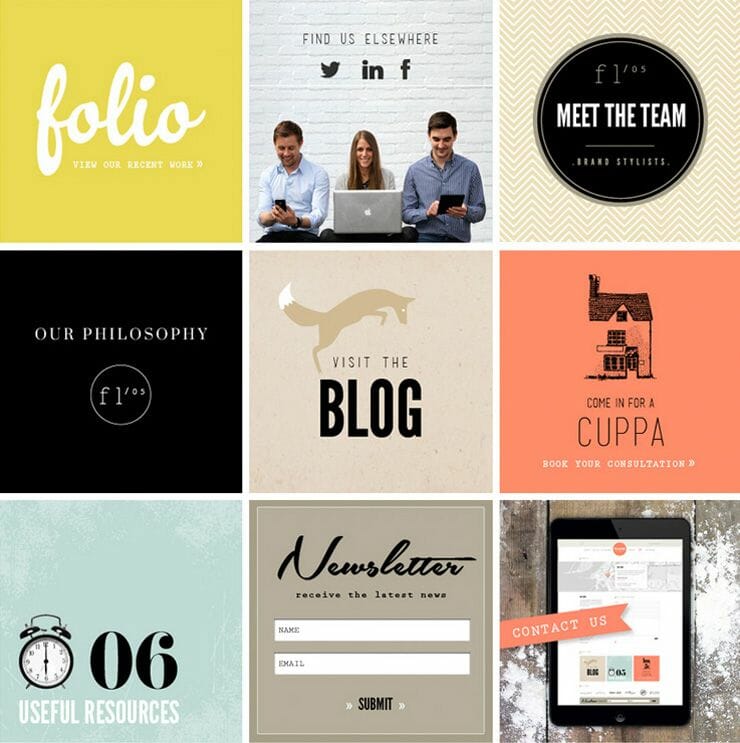
The Good: Flourish website
Beside this being a beautiful design, it’s also a great example of how naming links and elements on your website is extremely important in order to provide a great user experience.
Lesson to learn:
Name your links.
“Too Animated”
The bad: PayPal Receipt Concept on Dribbble
Animations are a crucial element of interaction design, but they should always serve a purpose. They should never be done because “they look cool”. Unfortunately, designers tend to have a love affair with animations, partly because animations are so fun to create that sometimes they go a little too far.
Vladyslav Tyzun’s animation concept for a PayPal email receipt, posted on Dribbble, is an example of animation done wrongly:
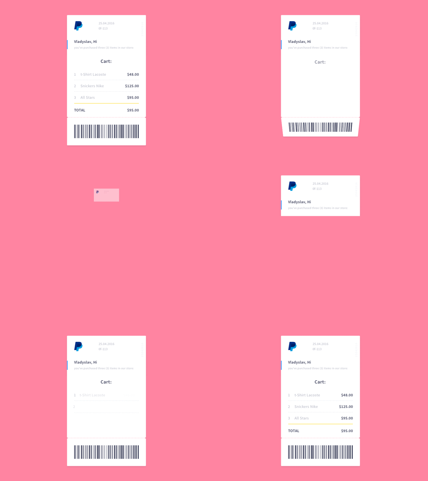
The animation is pretty, but superfluous. In total, it takes a whopping 3.5 seconds to see the transaction details. A simple fade-in of the receipt would be more elegant, and because it takes up less time, better for the user as well.
Remember, users come to sites for a purpose—we want to show them what they are after in a short space and time, not detain them in a grand tour of the gallery.
The Good: Stripe Checkout’s Animation
When we “animate with purpose”, however, the results can be great. Look at Stripe Checkout’s animation when the user receives a verification code, it’s sexy:
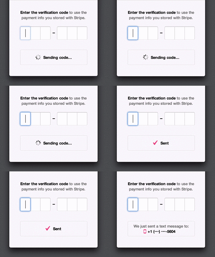
Stripe uses animations to make things seem faster than they are: it provides users with updates (like “Sending code…”) even though they might not have received the SMS yet. This prevents users from feeling frustrated at having to wait, and provides assurance that an SMS is on its way right now.
Lesson to Learn:
Always make your animation purposeful: too much can kill the UX of a product. Beauty has to pull its weight and be functional.

