E-commerce sites have come a long way, since their introduction to the Internet community. There are different types of e-commerce websites, each tailored to meet the needs of their target audience. Nowadays, you can find and purchase any product online, thanks to the significant development of e-commerce websites. According to Statista, e-commerce sales will reach 4.48 trillion dollars, by the time we reach the year 2021. As expected, e-commerce has a lot of potential, as users can purchase products, without even leaving the comforts of their houses.
When it comes to e-commerce websites, you will need to make sure that your web design is on point. Why? If your e-commerce’s web design doesn’t look attractive to your users, you will lose out on conversions. As a result of this, it will impact the overall revenue and sales of your e-commerce business. To ensure that your e-commerce website looks incredible at all times, here are four great tips:
1. Always suggest related products
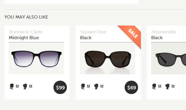
You want to make sure that your customers buy as many products of yours as possible. How do you go about this, without impacting the user experience negatively? By suggesting related products, you entice the users to take a look at all the other products that you have to offer. Even though this is a small web design tip for your e-commerce site, you will notice significant improvement in overall sales.
For example, take a look at Amazon, which always suggests similar products, to the one you are contemplating on buying. Similarly, you can do the same with your e-commerce website. Let’s say your customer is looking at buying sports shoes. You can suggest similar sports shoes, gym bags, and anything related to this activity. Also, try suggesting products that are on sale, to make it harder for your user to turn the offer down.
2. Avoid using too many pop-ups
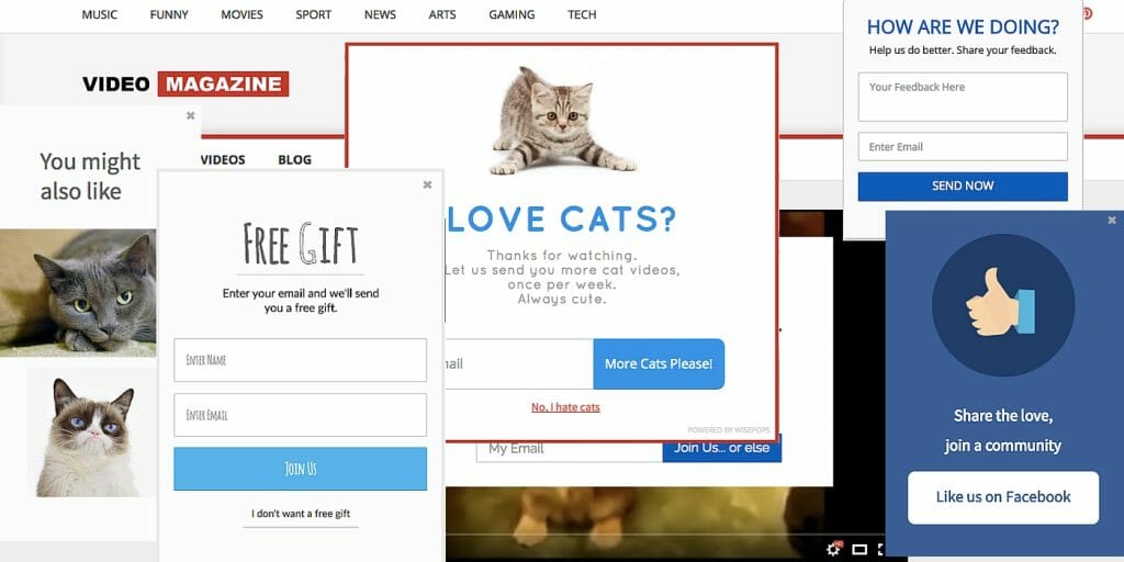
Using pop-ups is a great way to notify your users about discounts, on-going sales, and sign up for your services. However, using too many pop-ups in your web design will have a negative impact on your user experience, which will reflect on your conversions. Just imagine if you are in a hurry to buy a pair of socks, but you are greeted by pop-ups constantly. Too many pop-ups will slow you down, it discourages you from using the website, which isn’t a good thing.
If you do want to use pop-ups in your web design, make sure that you carry out user-testing before implementing it. Avoid using pop-ups in the mobile version of your e-commerce site, as it occupies a large amount of space, which isn’t good when screen “real estate” is limited.
3. Never use more than two fonts
Using a larger number of fonts in your e-commerce web design will be overwhelming for your users. For example, imagine going through a website that uses five or more fonts. When you go through this website, you will always feel it is distracting and cluttered. Now, you don’t want this in your e-commerce web design, so make sure that you don’t use more than two fonts.
The advantage of using two fonts is that you can do a lot with them, despite the limited number. Let’s say one font is for the heading, while the other is for the body text. Just with these two fonts, you can use their different weights such as bold italic, italic, bold, and regular, which is eight variations. With that many variations, you have enough diversity to make your web design look interesting, without overwhelming the user.
4. Simplify the buying process
The more complex your buying process, the higher negative impact it will have on your conversions and sales. When users face obstacles on an e-commerce website, they will go to another one. When simplifying your e-commerce’s buying process, make sure that your users can purchase the products with the least amount of clicks. Add a “buy now” icon to every product, so that your users can purchase them instantly.
Also, avoid forcing your users to create an account with your e-commerce website so that they can purchase products. Some of your users will be in a hurry, and they don’t want to waste time making one. Instead, you can make it easy for your users by letting them use guest accounts. That way, if your users are satisfied with your services, they will return to create an account on your e-commerce website, so that they can continue to purchase products.
These are the four web design tips that you can use to make your e-commerce website look incredible. If you are looking spruce up your e-commerce website, but you don’t know where to start, why don’t you get in touch with ANM.digital? Our professional developers and designers will get the job done at the right price!

