What is the first thing that comes to mind when you think of breast cancer ribbons or Amex cards? The color comes to mind before its shape. Colors are the twins of brands because they create a visual experience. Colors have a profound effect on our physical and mental state and they increase the allure of any object.
Studies from the Institute of Color Research (CCICOLOR) affirm that a decision on a subconscious level about the environment or person is made within 90 seconds. Playing an instrumental role in this process is the color. Our response to color is also influenced by our individual preference, upbringing, context, and cultural inclination. In the United States, for instance, white is associated with a blushing bride while the same is the color of mourning in India. There are other colors which have a universal response, like the color blue which symbolizes honesty, dependability, and trust, making blue the most common color used in logos like LinkedIn, Twitter, and Facebook.
Other colors and brand association
- Purple or pink is generally linked to fun, youthful feminine products, and is most commonly used in the promotion of beauty products.
- Red is used to draw attention to text or symbolize high energy, mostly to convey boldness or urgency. Think logos of Levis, ESPN or Netflix
- Green is the sign of goodness, organic, and healthy. It can also be used to represent nature and any environmental issues.
- Orange is the color for warmth, light-hearted fun. Famous orange logos are that of Fanta and Nickelodeon.
- Silver is the color of sophistication, enigma, and class. It makes perfect sense for the Apple products to be in silver.
- Another color which symbolizes sophistication is Black. Think of designer labels like Channel or powerful public voice like New York Times.
- The color which is ideal to signify cheer and optimism is yellow. Nikon, Best Buy, and Cheerios are examples of yellow-colored logos.
Power of colors and its effect is the reason why brands like McDonald’s’ maintain the same pallet of logos all over the world. The red and yellow McDonald symbol bring a sense of joy, a buzz of activity, and cheerfulness regardless of the country it is in.
Choosing the right color for your business logo
The color of the logo should only be chosen when the feel and voice of the brand is established. Following are some tips on choosing the right color palette:
- The primary color of the brand should be that of the logo. Logo color should represent the voice or style of the brand. Once established, an accent or secondary color can be added.
- The brand must maintain consistency to establish a style guide with the hex value. Background and grayscale colors must be well defined. Expanding on the visual design at a later time will become easy.
- A good logo has a maximum of 4 colors, either a variation of the shade or hue. There are tools like 0to225 which are helpful in selecting the right gradient.
- Want the key to success? It is as simple as repetition. Use the same color as that of the logo for all marketing purposes.
- Do not base the color of your logo with that of a competitor. Avoid confusion by choosing a unique color.
If the color is the obverse of a powerful logo scheme, then the reverse is the font. While content is important for customer engagement, typography is what latches onto attention. Although typography is the poor, ignored, but the talented counterpart of color, it is barely given its due credit. Without typography, highlighting a central message is impossible.
What is typography?
Typography, in simple words, is a stylish arrangement or the placement of words in a document or page. It is nothing short of a form of art with innovative placement patterns. Typography is the magic ingredient which adds personality, theme or emphasizes on a central idea. While black is considered as a standard, do not underestimate the effect of the colored text.
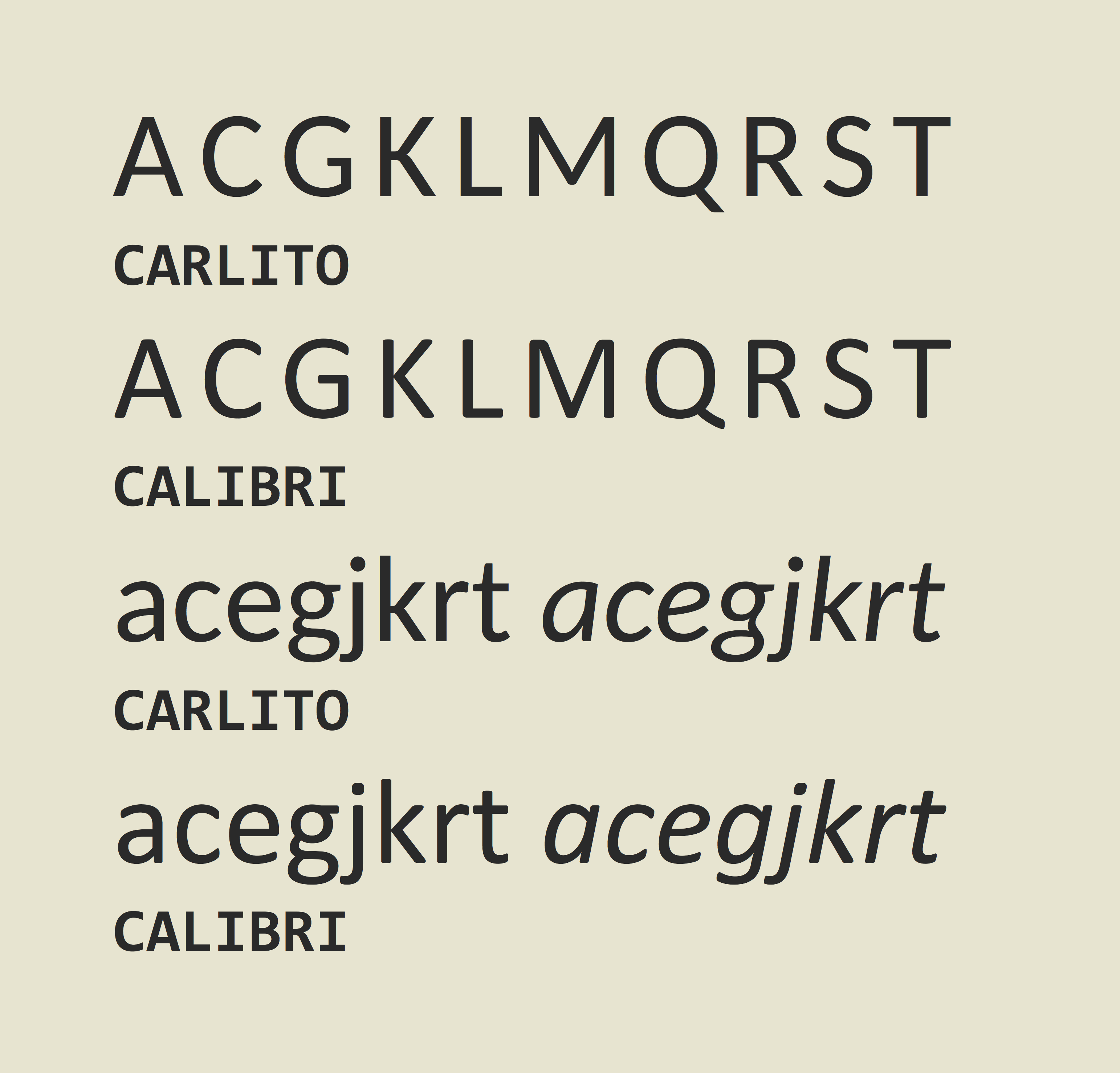
Typography has six key elements of which fonts have the highest impact. Fonts offer a lot more than just Times New Roman or Calibri. It refers to the style of text used to represent the typeface as well as the height and width. While Century is a typeface, Century 12, bold is a font. In the digital age, the font is often melded into the typeface.
Typefaces are the most distinguishable aspect of any typography. It represents the style which is used. A few common typeface examples are Cambria, Times New Roman, Arial and other stylized ones like Noteworthy and Chalkdust.
Importance of typography
Typography is important because it draws attention. In marketing, there is an aphorism that content is the king, typography the crown. Research reveals that the most preferred fonts are Comic Sans, Verdana, and Arial at size 14. Readers who were given a passage in Comic Sans agreed with the content as opposed to other readers who had the same text in Baskerville or Helvetica.
Clearly, both typography and color of content play a significant role in branding and advertising and neither should be ignored.
Color schemes and font designs matter a lot in website design!